Hearts Attached
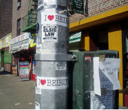
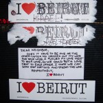
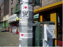 There is a subtle power in anonymous messages. Slurs scribbled on walls. Letters scratched into wood. Words plastered on lampposts. Acting as muted interruptions, they jerk the lazy gaze of the passerby to attention. The I ♥ Beirut stickers were meant to do just that. In the summer of 2006, they began affixing themselves to everything from trashcans and brick walls, to bus seats and street signs. First New York and Boston, then Paris and Toronto. The heart-bearing stickers multiplied, spreading across geographic borders and finding ways to adhere themselves to the pedestrian surfaces of numerous locales. The medium as the message propagated its hard won truth and proved its effectiveness.
But the power of this message is neither its ability to travel, nor its novelty. I ♥ Beirut could easily be dismissed as another rip-off of an original. Both idea and visual depiction are an obvious cooptation of the ever-present I ♥ NY campaign, created in the late 1970s by its equally ubiquitous designer Milton Glaser. The real strength of the NY slogan was never just in its ability to manifest itself on Times Square memorabilia. Its power is the reason behind the design, one that has everything to do with context. Glaser’s design came at a time when NY was least loved. With crime up, the economy down, and most of the country’s politicians sending the city to the dogs, I♥ NY was hardly created in an all-loving environment. This made its message all the more provocative. Glaser had fabricated a sentiment that didn’t exist in hopes of building a sense of morale.
It’s debatable whether the image’s eventual appearance on mugs and coasters symbolized the power of its sentiment or the vigor of commerce-driven absorption. But in recent years, with the events of 9/11, I♥ NY (if somewhat inadvertently) took on an added dimension. The visual became a constant reminder of a past tragedy, and represented the city’s will to survive–its need to move on.
Somewhere at the center of I ♥ NY’s distant and immediate past, lies the potency I ♥ Beirut taps into. In 2006, it became an image created in response to the War of July, the battle between Israel and Hezbollah that stole the city’s summer. The slogan’s targets however, were not the shrapnel victims or traumatized masses. They were people not necessarily involved, living in a distant political zone, moving in a different time. I ♥ Beirut was created outside the experience of war. It didn’t depict the encounter of the battle, nor did it acknowledge past or present events. There was no mention of Israel, Hezbollah, or the War of July. Its seemingly simple message displays a hesitation in pinpointing events. In its detachment, the image traffics its own ideas. It strives to draw attention to Beirut without reducing the city’s experience to a benign redundancy. It remains a response that stands apart—one that uses the potential of its context and its ability to be re-contextualized. The muteness of the sticker is its own intensity.
Beirut has been synonymous with violence. The brutal sixteen-year civil wars (from 1975 to 1991) had forever marred the city’s image. It had become a placeholder for destruction–a stage on which regional battles have always played out. Despite the supposed lift in the country’s post-war image and economy, the fear of sectarian conflict never really disappeared (as the recent 18 month political vacuum has shown). It remained loosely buried beneath the surface, like skeletons in sand. Capitalism refurbished the material result of violence. The city’s exterior became the primary focus. Bullet-ridden buildings were quickly demolished, with lavish resorts emerging from the dust.
Largely responsible for the city’s physical reconstruction was Solidere, a company formed by the government in the early 1990s  to rebuild downtown Beirut. Spear-headed by then-Prime Minister Rafik Hariri, Solidere’s aim was to quickly boost the city out of its wartime stagnation. With “Beirut, Ancient City of the Future” as its motto, however, Solidere avoided dealing with the present. It attempted to capitalize on Beirut’s controversial immediate past, by promoting its erasure. The company’s concept, solidarity, suggests the idea of differences set aside. Its logo depicts the national symbol, the green cedar, shaped in a way to resemble the “B” and Arabic ba of Beirut. This message suggests a Beirut for everyone, a nostalgia for a unified whole. Solidere’s secondary logo, Beirut written in Arabic, resembles abstract brushstrokes on an Impressionist painting. Each letter is in a different vibrant color, symbolizing the multi-cultural energy of the city. This logo adds the layer of cultural diversity to Solidere’s icon of unity. It nostalgically calls forth the pre-war image of the city, where Maronites, Sunnis, Shiites and other minorities lived together in civility.
Solidere’s reconstruction began with the city’s center. Central Beirut was the location of the city’s most important past and present landmarks, from remnants of Roman Berytus to the 1970s Green Line that had split the city in two. By resuscitate the heart of the capital, Solidere hoped to circulate life throughout the damaged nation. The immediate past, however, with its years of inter-communal destruction and mindless brutality, couldn’t be undone. To most locals, Solidere’s image of unity was perceived as capitalistic speculation. Mending the city’s essence couldn’t come from brick and mortar. The heart Solidere reconstructed belonged to a center that the war had altered, one that now memorialized an absence.
The origins of I ♥ Beirut are different. The real strength of the icon is that it marks a shift. It embodies a Beirut that is in the process of becoming. While Solidere’s image was a reaction to past sectarian conflicts, I ♥ Beirut is a response to present-day Beirut, one that isn’t trapped in nostalgia for the past. No promises are made of seamless unity, or economic prosperity. The message is simply the reiteration of a sentiment triggered by threatening events of the moment. The optimism of the statement sets it apart from the media’s dominating images of anger, hate and resentment. In such a context it becomes an unobtrusive call for survival.
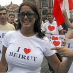
The I ♥ Beirut campaign did not represent a single group sentiment. I ♥ Beirut ‘s position is one of do-it yourself protest. The “I” only interpolates the personal, and the message’s responsibility is open to anyone willing to participate. Placed in different cities, amongst the flyers, graffiti, and ads of varying urban contexts, the sticker blended into local pedestrian scenes. The foreign politics of its message however, made the image stand out. In turn, such appearances acknowledge those who wish to look back: the Lebanese expatriate communities. To its diaspora I ♥ Beirut represented a banding together of hearts displaced.

